SEI Design Group Brand Refresh!
SEI Design group and Creative Ideology had been working on this new brand refresh since last year and they finally unveiled their new brand at an industry trade show a week or so ago so we can now show everyone.

SEI Original Logo
The new brand is based on their old logo but with a new updated look to represent their company. SEI went ahead with the brand refresh because they are celebrating their 10 year anniversary this year in June.
During the rebranding process CI had the opportunity to work closely with SEI partners including Ted Mountain, Steve Staveski, Gian Paul Piane, Mike Ebertz, Vic Tomaselli and Brian Cieslinski all of whom had a very strong desire to keep some of the old legacy logo look but with updated colors and tone. They wanted to get away from the heaviness of the old logo but keep the “hidden 6” their original logo was based on. This number was important because there were 6 original partners when SEI started and SEI is the Italian word for “six”. CI worked through many logos to arrive at the new design, which pleased everyone, especially the new generation of talented architects and designers at SEI.

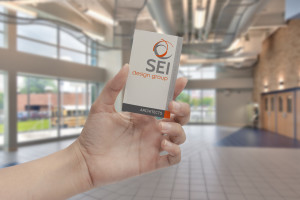
SEI Business Card
SEI has a new business card to go with the new look and are busy incorporating their new logo into all their day to day business needs.
CI has also been working on a custom website for SEI which is now under development. Currently CI placed a temporary website while the new website is finalized at SEIdesigngroup.com. This website was done using bootstrap, html5, SAAS and CSS3 to achieve a responsive website that would be in place until the unveiling, but still be able to generate contacts and interest.
“We can’t wait to show you the completed brand refresh applied to the website in the coming months. It is very exciting!”–Michelle Martorell
Creative Ideology and Michelle Martorell are very proud to showcase this new brand and want to congratulate SEI Design Group on their upcoming 10th anniversary. Your next decade in business is looking fantastic!


Comments are closed.