Branding Trillium Health While at Archer
I was very happy my logo design was selected for the rebranding of Aids Care to Trillium Health. Here is a story published at Archer about the work that went into the branding. I love what Trillium does and I worked closely with them during the creation of their Annual Report.
Story originally published in archetype.
AIDS Care was a healthcare organization with a unique model of care where those affected by HIV/AIDS could receive primary and specialty care in one convenient location. The organization also offered a full range of supportive services and outreach programs.
Because this model of care was so effective, the organization decided to extend it to other underserved populations, including the Hepatitis-C and LGBT (lesbian, gay, bisexual, transgendered) populations, as well as the local community. Because of this expansion, rebranding was a must.
Archer’s task was to develop a brand that positioned the organization as a more inclusive organization that served diverse populations that would benefit from the well-developed and highly effective model of care.
Our process was thorough and included a range of phases, including market research via in-depth interviews, brand strategy and architecture development, concept exploration and execution, and rollout considerations.
Today, AIDS Care is known as Trillium Health. With the new name, the organization received a fresh graphic identity, a tagline, and positioning statements, including a brand promise and elevator speech.
The Rationale:
There is extensive thought behind the name. Essentially, a trillium is a wild flower native to Western New York. It is a three-petal flower, and each petal can be thought of as one of the three components that comprise the Trillium model of care (primary care, supportive specialties, and community support).
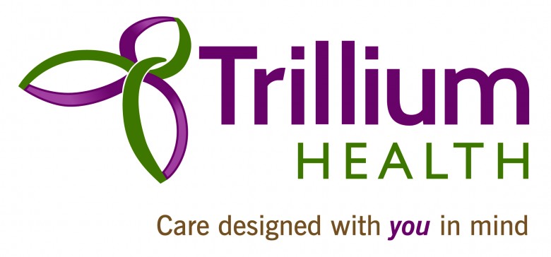
The graphic icon represents the trillium flower and the concept of integrated services. The off-centered angle of the icon suggests individuality and the sanserif fonts are clean and authoritative, inline with the healthcare services provided. The colors are unique and relevant to the colors of the trillium flower.
The tagline, “Care designed with you in mind,” is rhythmic and presents the basic premise for Trillium Health, a premise somewhat lost in many major healthcare providers, yet a key differentiator. It is memorable and extendable for future growth.
Brand promise: Trillium Health promises to deliver integrated, personalized primary and specialty medical care to people from diverse communities who have unmet healthcare and social service needs. Our unique model of care provides a full continuum of services and programs, and extends into the community through outreach and education.


Comments are closed.